Creative Printmaking
This was one of my favorite elective classes I have taken in my Graphic Design education. We learned a variety of different printmaking techniques and I was proud of most of the ones I made. Each one had its own limitations and unique uses making different types of designs more compatible with certain techniques.
Photopolymer
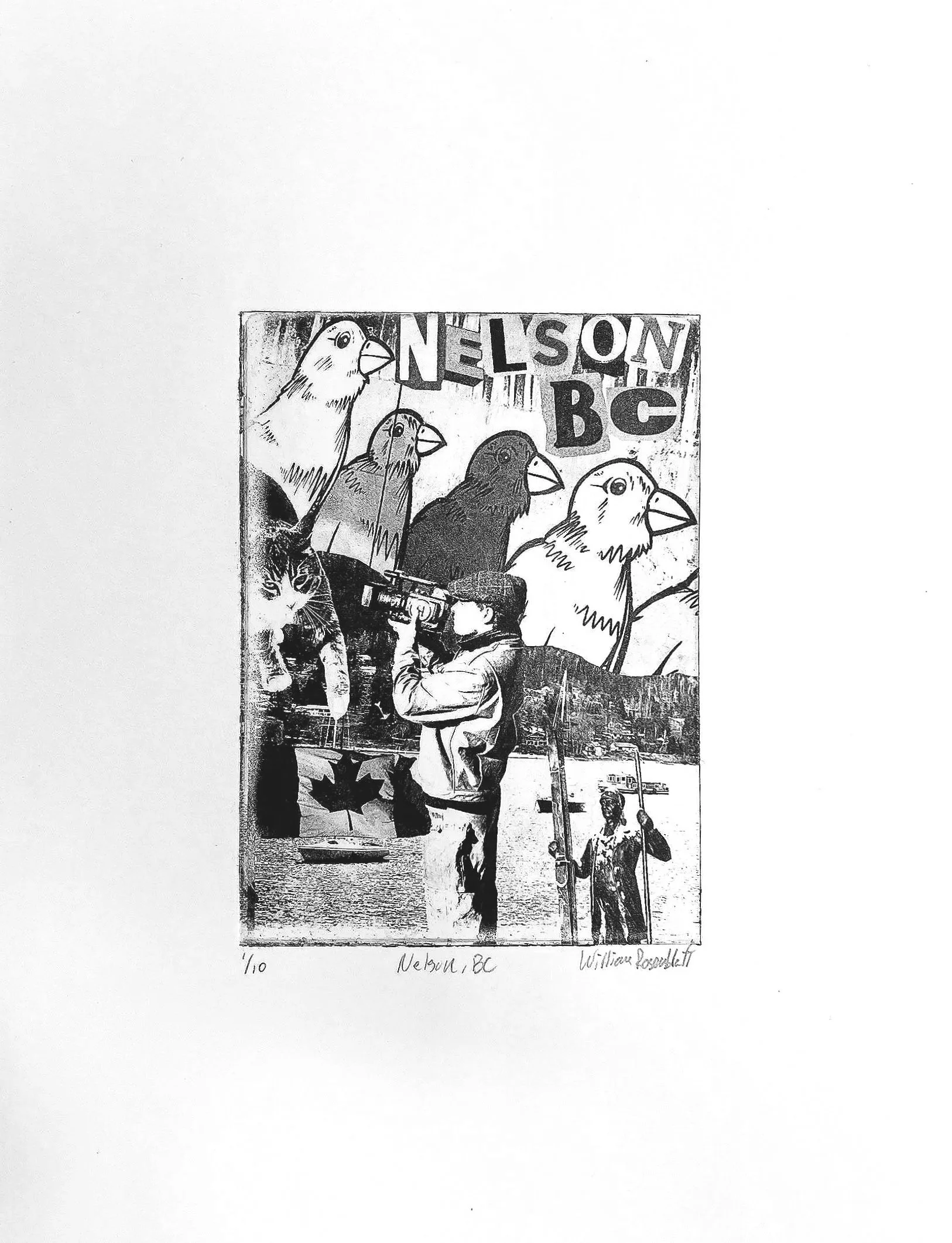
For this assignment the class was instructed to create a collage either in photoshop or by hand, that we would then use to make a transparency sheet. We then would use the transparent sheet with our design on it to expose our plate with it under a light box to create the plate for printing. It was important to test the transparency with different times of exposure to see which level of contrast would work best for our design. I am really happy with how this turned out on my end. I created a collage from pictures I took on my spring break to Canada for a snowboarding trip and ended up with a bunch of prints in different colors to give to my friends I went on the trip with!
Relief/Linocut
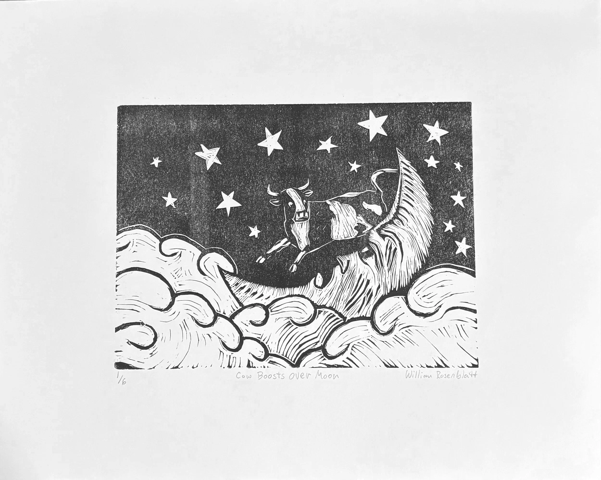
For the linocut print we were given a linoleum plate, which has a gray surface that you carve out to create a design. When creating your design there must be some forethought and planning because what you carve away will not be inked, which I found challenging especially when making the moon. The design was required to be related to a nursery rhyme, folklore, fairytale, or legend. After doing some research on some different stories I could make the design around, I eventually landed on “The Cow who jumped over the Moon” as it was one my mom read to me when I was little. I was very happy with how this one turned out.
Drypoint
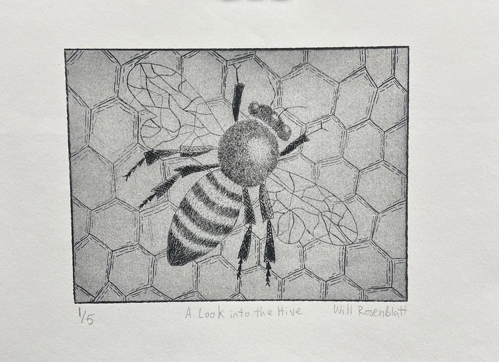
For this assignment the class was instructed to create a design of an figure or animal in a setting for this dry point print. I created this design of a bumble bee in a honeycomb background to etch into the plate and it was very helpful to know what type of strokes to do for certain areas to create the desired effect I was going for. For example, the downward repeated strokes for the striped portion of the body created a nice fuzzy look for the bee. Initially it was hard to know how deep I should carve to get a nice straight line, but the small test plate Sally gave us to experiment with answered those questions. If there is anything I wish I had done differently, I wish had spend more time creating a cleaner crisper image to transfer onto the plate. I think this would have resulted in a little bit more realistic look and feel.
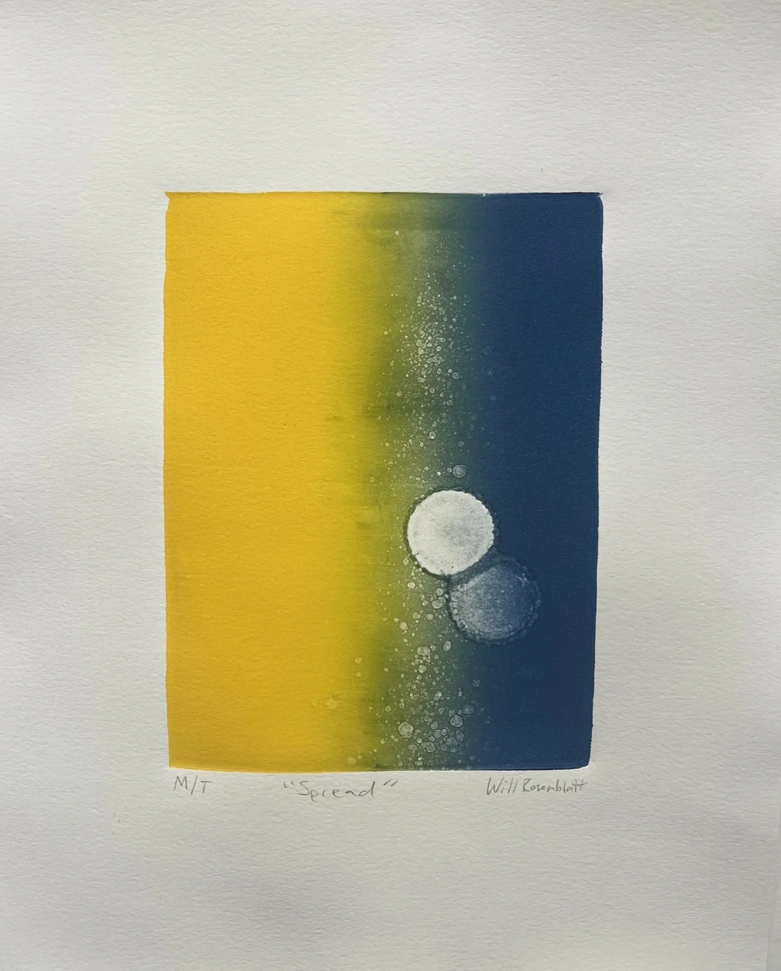
Additive Monotype